")
First impressions count. Your subscribers are becoming increasingly picky and will decide after one scan whether or not to abandon your emails. So it’s important we meet these ever-growing expectations by understanding the basics behind what makes a really good email design and what makes a terrible one. Strap yourselves in because we’re going to clear the fog on your design lens so you can understand all the mechanics that go on behind the scenes.
Email Subject Line
You’ve put in the hard yards to craft your beautiful email campaign, now the challenge remains in getting your subscribers to open it. Your email subject lines provide a small window of opportunity for you to reel them in, so you need to make those first impressions count. Here are our top tips to help you create better email subject lines that will boost your opens.
Avoid spammy words
Using common sale-sy terms, highlighting phrases in CAPS or going overboard with your exclamation points are all likely to trigger red flags. If you don’t want to fall into hot water, consult this checklist of 100 most common spam trigger words before you begin crafting your next email subject line.
Keep it short
We generally recommend keeping your subject line between 25-30 characters. This should be enough to introduce the overall theme of the email. Leave your preview text or pre-header text to flesh out the rest of the details.
Use emojis wisely
When used correctly, slapping an emoji into your subject lines can take your open rates to new heights. We recommend using them sparingly and before inserting one consider the relevance to your audience. Check out Emojipedia, your definitive guide to emoji meanings and common usage.
Get personal
Start the conversation on the right foot by addressing your subscriber by name in the subject line. Not only will this humanise the interaction but it’s a surefire way to get those heads turning.
Positioning is key
As busy humans, we have become pros at scanning and deciding within seconds whether the information is important or not. That’s why you need to make sure your call-to-action words are positioned within the first three words of your subject line.
Sense of urgency
There’s nothing like a fast-approaching sales deadline to entice your hungry bargain shoppers. Using time-sensitive copy like ‘last chance’, ‘offer expires’ or ‘only x days left’ will help drive the message home.
Entice them
Straddle the line between informative and intriguing by asking a question or using an enticing listicle. The following examples effectively introduce the topic of the email without giving away any spoilers.
- Example Question: Will live events return in 2021?
- Example Listicle: 11 Strategies for Running a Succesful Event in 2021
A/B test your subject lines
If in doubt, test! We recommend conducting a/b split testing on your email subject lines for a minimum of 2-4 hours if you’re comparing open rates.
Email Width
What is the best width to use for your email marketing campaigns? A question that is often asked and met with a range of different possibilities. So how do we determine the perfect sweet spot to compliment our email designs. Historically we’ve been given 600px as a default because it’s considered the “safe zone” that is more widely supported across email clients. However, we went digging a little deeper to find our pixel perfection.
Here are two healthy sizes that are optimised for mobile:
- 640px – half this size is 320px (narrowest iPhone width)
- 660px – divides nicely into 2, 3 or 4 columns
Power Up Your CTA Buttons
They serve the very important purpose of transporting your customers from their inbox to your landing page. Here are a few things you need to consider to make sure their journey is frictionless and as smooth as possible:
Size
If you want your buttons to look desirable you need to make them finger-friendly. Anywhere between 45-50 pixels is generally considered a healthy size for both clickability and readability.
Colour
Colours like green and orange generally perform the best in terms of engagement. However, in saying that you shouldn’t be jumping ship to change to colours that are off-brand. If you want your CTA to inspire action check out this colour psychology infographic which demonstrates the influence of colour on purchase decision.
Copy
Decide your key message or action you want your reader to take. Is it to check out your blog, shop, book a demo? Use CTAs that invoke action (it’s named a call-to-action for a reason). Positive verbs will encourage a positive response from your readers.
It’s always best to keep it short and simple, with 2 to 4 words. Of course, you can be more creative than the boring old ‘learn more’ and ‘click here’ but be sure your CTA copy is clear and complements your email theme.
Be more relatable and use first-person like ‘I’ or ‘me’ in the copy to better engage the reader. Examples would be ‘Count me in!’, ‘Yes! I want to save more’ or ‘Save my spot.’ This makes the CTA more personable and will more likely prompt a click.
Position
Often our email elements are competing for the prime position “above the fold”, however, your main CTA button is one element that should never be sacrificed. Positioning your main CTA in the top half of your email helps establish a mental queue for your readers, creating a natural flow that invites them to scroll. We recommend reusing your main CTA at the end of your emails as well. After all, what’s the point of encouraging your readers to scroll to the bottom if there’s nowhere to go.
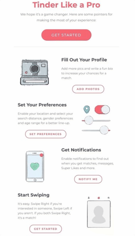
Just like a text hierarchy, there is a natural hierarchy for buttons. When you have multiple buttons in your email, you want to design the most important CTA to stand out. That’s where ghost buttons come into play. Ghost buttons like the example from Tinder (below) are transparent, secondary call-to-actions that give an order of importance to what action you want your subscribers to take.
Email Typography
With so many fonts out there it’s hard not to go crazy with your email copy. But before you start going on a font frenzy, you should get to know the very basics of email typography. Best practice says stick to your web-based fonts. The majority of email clients support the following fonts:
- Arial
- Comic Sans MS
- Courier New
- Georgia
- Lucinda Sans Unicode
- Tahoma
- Times New Roman
- Trebuchet MS
- Verdana
If you want to play around with different fonts, make sure you conduct a thorough test to see how your fonts render across different email clients. Email browsers that don’t support your chosen font will substitute a default that may be completely different. To work around this, select a fallback font before sending.
As a general rule, when you have a chunk of copy in your emails, stick to using left-aligned text. A straight left edge allows your readers to easily glide over each sentence without losing their place. While centred-text isn’t off-limits, we only recommend using it for headings or short sentences that are easily scannable. Justified text on the other hand is a big no-no. Not only do the rivers of whitespace disrupt reading flow but the copy becomes barely readable for visually-impaired users.
Your emails should also contain a hierarchy of text, this essentially means wrapping your headings in the appropriate <H1> <H2> tags so your email is easy to follow for subscribers using screen readers or other assisted devices.
Colours
Colours play a powerful role in your conversions. With 85% of consumers identifying colour as a primary reason why they make a purchase, it’s safe to say this design element matters a great deal. Check out colour hues that are primed to dominate in 2021.
While your colours need to remain on-brand you also need to make sure they complement each other. To assess the readability of your colour combinations use Contrast Checker to test your background and text contrast ratio meets Web Content Accessibility Guidelines (WCAG).
I know it’s easy to go overboard with your colours but try to limit yourself to three. An easy way to do this is by developing a colour palette for your brand. Make sure each colour serves a purpose for e.g. functional background colours or accent colours which help draw your readers’ attention to something important. By keeping it consistent your subscribers will be accustomed to the colour hierarchy you set and will automatically start reading your emails the way you want them to.
Personalisation
Personalisation goes way beyond using first name wildcards in your emails. While addressing your subscriber by name makes for a great first impression, you can’t rely solely on basic personalisation techniques to maintain engagement rates. Customers have come to expect this as a basic necessity in their emails, so we need to start looking ahead at creating more advanced personalised journeys for our customers.
If you feel confident navigating your way around your data then you can take it up a notch by introducing conditional content, otherwise known as dynamic content. For those of you who are new to advanced personalisation, conditional content allows you to draw on your different data sets to create different variations of the same email. Here’s a couple of ways you can put it into practice:
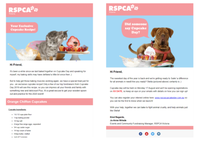
1. Cats vs. Dogs based on subscribers’ preference settings
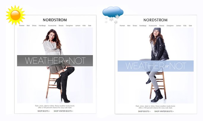
2. Winter vs. Summer clothing based on subscribers’ geo-location
3. Male vs Female based on subscribers’ gender
4. Behaviour based on account activity/personal progress
Images
There’s a lot more to email imagery than you might think. We not only rely on them to create visual intrigue but set the emotional tone of the email. All too often we see images used for no reason that add no value to the reader or your email.
Choose images that set the mood
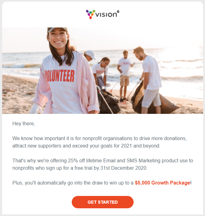
Unfortunately, many of us don’t have the resources to create bespoke photography or illustrations, so stock photos are our go-to. If you want your images to create a feeling of authenticity, opt for images that use depth of field over traditionally flat designs.
This essentially means finding images that draw focus on the foreground elements while keeping the background blurred. Take the example below, this image immediately communicates a story of a female volunteer. The background remains blurred as not to divert our attention away from the main message.
Another way to create depth in your images is to create a blurred gradient between your email elements. This pulls the image into the email, creating a cohesive flow that allows the reader’s eyes to comfortably pan downwards.
To save you jumping from platform to platform to find high-quality stock images, Vision6 is introducing a stock images gallery where you can browse, download or upload your chosen image to your email campaigns without having to leave the platform. This feature will be coming soon so stay tuned!
Personalisation
Delight your subscribers with a personalised message in your email hero image. We teamed up with our friends over at Nifty Images so you can deliver personalised email content based on real-time data that is stored in your Vision6 account.
Format
If you’re using high-quality photography, JPEG is the best file format to use because they are more widely supported across email clients.
Size
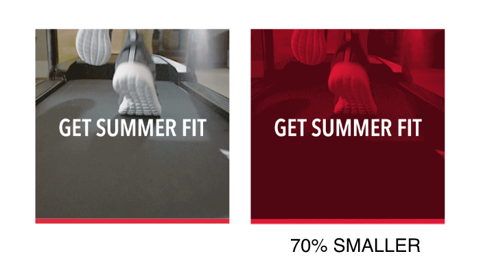
High-resolution images tend to come with hefty file sizes. As a general rule we say don’t let your images exceed 1MB. Keep it cruising around 500KB for an optimal load time. If you’re looking to resize or compress the file size of your images we recommend using smart editing platforms like Photoshop. Try to avoid web compression apps as they tend to taint the quality of your image. The width of your email provides a great benchmark for sizing your images especially for your email designs that use multiple columns.
How many?
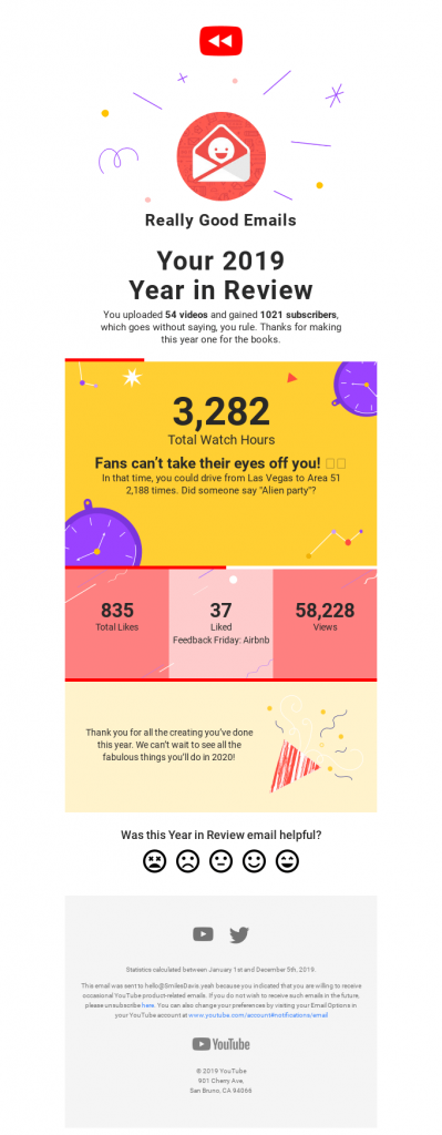
While there isn’t a limit to how many images we should use in our email campaigns there is such a thing as too many and this is a common mistake we see all too often. Not only does it slow your load time but if you’re relying on images to communicate the bulk of the message, your emails could end up looking like this tragic mess:
Alt text
Make sure your Alt text is meaningful and explains exactly what that image is. You’re probably thinking yeah yeah heard it all before but the fact of the matter is many marketers continue to miss the mark. With most email clients blocking images by default, it’s crucial to add alt text to your emails so your readers can distinguish between which images are relevant or purely decorative. Just think what is the action you are getting your readers to take and how would you prompt them to take that same action if the image was blocked. Here are a few best practices and examples to break it down for you:
- Make sure your Alt text isn’t repeating phrases in your copy.
- If you have an important message displayed over your image use it as your alt text because a message is way more important than a primarily decorative background.
- Keep your alt text short. Not only because it’s easier to scan and digest but the copy won’t interfere with your readers’ scrolling.
- If your image is there for decorative purposes you can use your alt text to indicate that
- If your photo is linked to a CTA, it’s important to convey that in your alt text so you can still encourage click-throughs.
Videos
Unfortunately, many email clients don’t support the technical requirements needed to play a video in email. So don’t purely rely on your video content to carry the core of your message, instead use it as a reinforcement to build hype. While videos boost click-through rates, it’s best to embed them below the fold to encourage readers to scroll but also not draw attention away from your main CTA. To avoid the embarrassment of playback errors and other technicalities, we recommend dedicating a landing page to host your video.
Using videos in your emails is a great way to interact with your subscribers and drive them to your YouTube channel to binge your content. Here’s a couple of ways you can incorporate a video that will delight your audience:
- Remodel your blog content
- Teasers for upcoming events
- Event recaps
- How-to tutorials
- Customer testimonials
- Staff onboarding or internal comms
- Meet the team videos
Gifs or Animations
By adding movement to a typically static message, you will instantly capture your subscribers attention. Gifs or a fun animated illustration is a great way to surprise your audience and flirt the line of cheeky humour. However, there are some design hurdles you may face when experimenting with gifs in your emails. Here’s how you can overcome these hiccups and optimise your design for accessibility.
Unfortunately, ancient email servers like Outlook 2007, 2010, 2013 aren’t big fans of animated images in emails. These old-timers will only display the first frame by default. So if you’re creating your own frame-based animation in photoshop, make sure the first frame compliments your copy and includes any important call-to-actions.
File sizes also tend to get out of control when you’re using Gifs which can dramatically slow your email load time. Ideally you want to achieve a high-quality animation at a small file size. Easier said than done. As a general rule your gif size should remain under 5MB. Here’s a couple of quick fixes to trim down your file size without sacrificing quality.
Using as few frames as possible
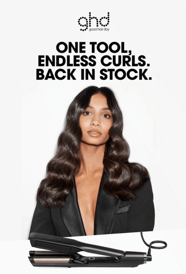
This can be achieved by opting for “cuts” over “fade” transitions. While fades make for smoother transitions, they tend to fatten up the file size by using more colours and frames. There are plenty of ways to make a visually stunning and eye-grabbing gif using the cut transition, take the example from ghd hair below:
Keep your colour palette minimal
Stick to Illustrations as they tend to use more solid colour hues – compared to photos or videos that use more complex colour schemes. You can also try overlaying your photo, video or animation with a single colour. This not only allows you to give a monochrome look to your gif that feels on-brand but it breeds smaller file sizes.
Keep it plain and simple
At the end of the day, there’s no need to spend valuable hours on making dramatic gifs when a small animation like the example below takes less time and is also equally as effective. The movement, although small, is just enough to grab the reader’s attention but not distract them from consuming the main content of the email.

Mobile Optimisation
Give your mobile clients as much attention as your desktop clients. Bit of no-brainer, but with the majority of emails being viewed by mobile it’s just as important to test across your different mobile devices to make sure your content renders correctly. Here’s some simple design tips to ensure your emails are mobile-friendly:
- Keep your subject lines within the 25-30 character limit. If you’re going to use more characters, make sure your subject line still makes sense before the cut-off.
- Make the most of your small real-estate by using preview text to entice more clicks.
- Don’t go overboard by using too many images or embedding large files that will delay the mobile load time.
- Use a healthy combo of image and text blocks to ensure your content is neatly stacked when reading in mobile.
- Make sure your buttons are finger-friendly.
- Keep your emails one to two columns, so that you’re not forcing your readers to horizontally scroll.
- Use responsive template designs, so you can put out your best foot forward no matter where it’s being read.
Vision6 has a range of different template designs so you don’t have to worry about content cropping or your email rendering incorrectly.
Email Layout
Whitespace is your new best friend when it comes to decluttering your email elements. Don’t pollute your email with too many design elements that are competing against each other for attention. Use your email spacers and dividers to give your images, text and CTA buttons room to breathe. This will help establish a clear hierarchical flow to lead the eye.
Think of your email design as a shop window – you want to give your audience a sneak peek of what you have to offer in the hopes of enticing them to explore further. Your subject line and hero image should be designed to achieve this. People are time poor so they want something that is easily scannable. If you’re sending emails that force your readers to endure endless scrolling it’s not going be a smooth ride fo your readers.
Here’s are a few Vision6 email layout examples that create clear groupings of content to allow for easy consumption:
Inverted pyramid
This layout helps structure all your email elements in a way that draws the eye to the all-important CTA.
Zig zag
This visually pleasing layout is best used to break up large blocks of copy making it easier for readers to process.
One column
If you want to give your emails a fighting chance, use this mobile first design to avoid the embarrassment of image cropping, horizontal scrolling and content rendering incorrectly.
Rule of three
To avoid boring your subscribers with excessive scrolling, stick to this universal best practice of limiting yourself to only three sections.
Footer
In terms of design, email footers are often overlooked and don’t receive much attention. Your footer may be the last thing your readers see, but it’s a valuable piece of real estate where recipients can get more information about you. So it’s important to make sure it remains up to date, especially with details that may be subject to change like your point of contact, calendar year and workplace address.
Your email footer also provides a great home for other important information that tells your readers more about your company:
- Social icons linking your accounts
- Disclaimers about any promotional offers
- Permission reminders
- Your company name, website and copyright information
- The subscriber’s name and email address
- Contact details or any relevant support links
- Copyright information
- Apps (if applicable)
As we see more light being shed on existing anti-spam laws and data privacy legislation like the GDPR, it’s become critical for us marketers to cement the legitimacy of our emails. Information like your unsubscribe link, return email address and your privacy and confidentiality disclaimers are your bare necessities to maintain compliance.
Including helpful information like this not only builds consumer trust but helps users distinguish your email from spam.
Get Ready to Send Your Masterpeice (Pre-Send Checklist)
Your email design is prepped, polished and ready for the runway to the inbox! But before you hit send, we made this handy dandy pre-send checklist so you can make sure your email campaign travels without a hitch.
If you’re in need of more email design inspiration check out our email design awards page. Maybe you can give it a red hot crack this year. Sign up to our newsletter below so you know when we’ll be hosting our next Inaugural Email Design Awards.