Dark mode is taking over screens everywhere! And it’s not hard to understand why when you learn of all the benefits; it’s easier on the eyes, saves battery life, and improves content legibility. But unfortunately, dark mode also adds another layer of complexity to email design.
It’s important to understand how dark mode affects your emails and what design adjustments you can make to ensure your email perfectly complements both environments. So we’re going to be airing the dirty laundry on our own email blunders and showing you exactly how to avoid them.
What is email dark mode and how does it affect me?
Dark mode is a setting that subscribers can select to adjust their inbox UI to a darker palette scheme. It basically inverts the colours in your email to reduce the amount of light on the screen.
The most common example is when email clients invert a white background with black text to a black background with white text. On the surface, this may not seem like a huge deal but when you start adding more colour contrasts, images and icons to your emails it opens up a whole new can of worms. Here’s an example of some of the rendering issues that HTML emails experience in dark mode.
Which email clients support dark mode?
No surprises here, but big players like Gmail, Outlook and Apple are among the few which support a dark mode setting.
Mobile
- iPhone Mail
- iPad Mail
- Gmail App (Android)
- Gmail App (iOS)
- Outlook App (Android)
- Outlook App (iOS)
Desktop
- Apple Mail
- Outlook 2019 (Mac OS)
- Outlook 2019 (Windows)
Webmail
- Outlook.com
- Hey.com
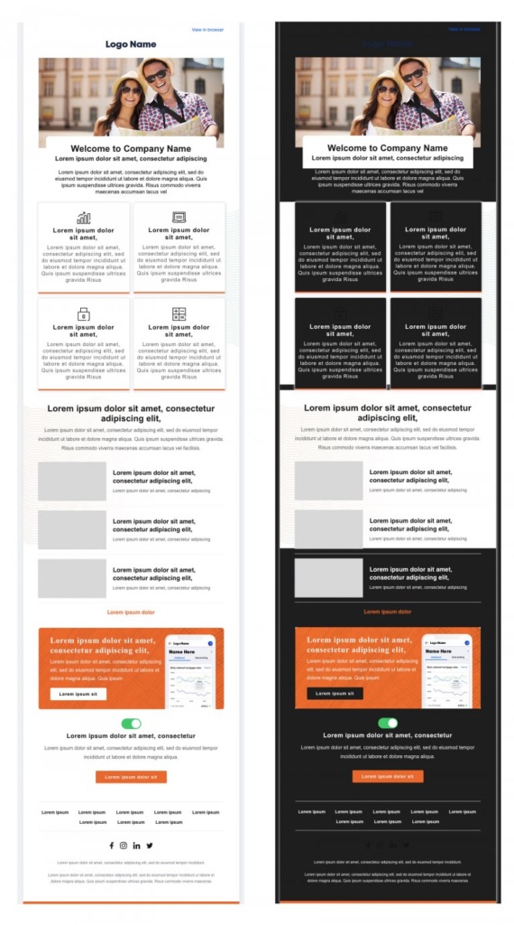
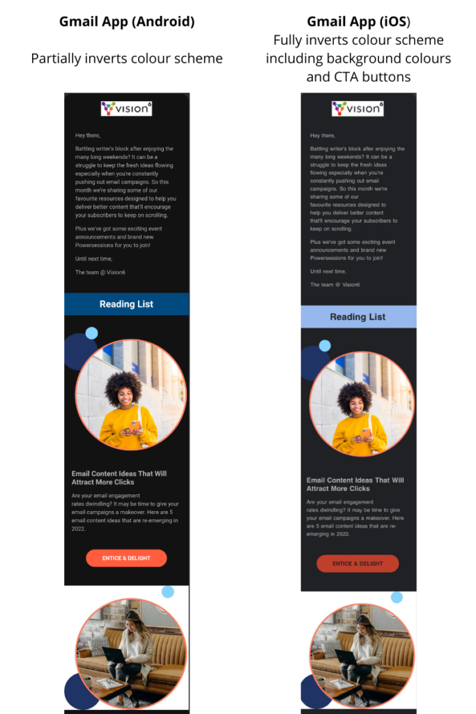
Unfortunately, not all emails behave the same way in dark mode. It is very much dependent on the email client version and the device you open your email on. Here’s how our newsletter appears in Gmail on different devices that have dark mode enabled.
Gmail (Desktop) – Automatically defaults to light mode

Take care of your logo
If your brand colours include darker tones, then using a transparent PNG for your logo might render it almost invisible in dark mode. Try adding a lighter stroke around your logo so it blends seamlessly in light mode but when thrown into dark mode it will help your logo stand out.

You can create a unique border around your logo so that it doesn’t appear chunky or out of place in dark mode. Take the example below, the white border is completely invisible in light mode.

Alternatively, you can design multiple logos to suit a light and dark environment. Our branding assets consist of an all-white, and all-black version of our logo. However, if you looking to switch out your standard logo for an all-white version in dark mode, it will require experience in HTML code.

Choose the correct file format for your images & icons
Dark mode isn’t known to alter images of any kind. However, there is a rare case where any image under 100 px can be inverted in Gmail on android. This would be the case for small social icons so we recommend keeping an eye out for this.
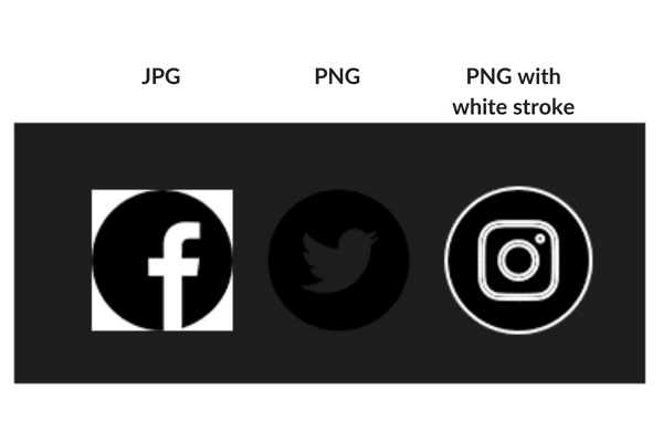
You do need to be aware of how your images appear on both a light and darker backgrounds so you can determine whether you need to upload your image as a JPG or PNG. Take the examples below.

Here you can see the JPG image looks out of place and gives the email a rigid feel whereas the transparent PNG blends seamlessly in dark mode.
On the other hand, your social icons or any small icons may be unreadable with a transparent background. If you don’t have a lighter-coloured stroke around your icons (like the example on the right) then we recommend uploading your icons as JPGs so they don’t disappear in a darker environment.
Adjust the colours of your call-to-action buttons
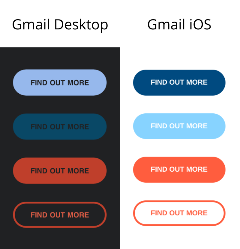
Something else we noticed when testing our emails in dark mode was how the colour inversion of our CTA buttons were completely off-brand.
So we had three workarounds for this:
We tested different colours and found that our orange colour remained consistent across light and dark mode. While the white text has been inverted to black text, the CTA copy is still readable to subscribers.
Styling our CTA as a ghost button with the orange colour. However, this transparent design is best employed for secondary CTAs.
If you want to make sure your CTA colours are not altered in any way then you can upload your CTA as an image. The only downside to using images is that some email clients automatically block email images.
Test time!
A quick way to test whether your images or icons are compatible with dark mode is to change the background element colour to #000000. But as we know emails behave differently in different environments, so if you want to make sure your designs are compatible with light and dark mode you need to test them properly.
Don’t worry we don’t expect you to create a test account for every single version of Outlook or start signing up to Yahoo, Bigpond, Hotmail and Gmail. Our integration with Litmus allows you to test your email on different email versions, servers and even different devices!
If you want more information on how to conduct Litmus testing in Vision6 check out our step-by-step guide here: Test Your Email WIth Litmus Inbox Testing.
Embrace the dark side
You don’t need to have a fully coded email to suit a dark mode environment. You also don’t need to completely redesign your branding assets and colours. Slight adjustments like adding a white stroke around your logo or even using fewer colours and colour contrasts in your emails are simple optimisations that require no coding.
Ultimately, it will come down to testing how your brand colours are inverted, what design tweaks you can do to make your images stand out and what file format is the best option for your images.