When it comes to your email call to action we don’t lend too much thought to design. However, little did you know that even the smallest tweak to colour, size, or copy can have a profound effect on subscriber engagement. So we’re going to dissect the anatomy of an irresistible call to action button by answering some of your frequently asked questions and providing some cool examples for reference.
What size should your call to action button be?
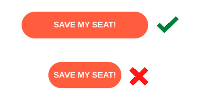
I like big buttons and I cannot lie…and so do your subscribers! Especially those who favour opening and reading your emails on a mobile device. Your CTA button size should be a minimum of 44 pixels tall. Any smaller, and you’re forcing subscribers to zoom in to click your button which doesn’t provide a user-friendly experience. The width of your CTA will depend on the number of characters in your copy, but make sure you add padding on either side so you’re not crowding your text.
Want an easy way to preview your email across both desktop and mobile? Use the toggle button at the bottom of the screen in your Vision6 editor.
How should I design my call to action?
If your call to action button doesn’t look like a clickable link you may want to consider adding rounded corners, increasing the border volume, or giving your button a shadowed effect.
Take the email examples below which both use a transparent design for their call to action buttons. Supergoop adds a shadow effect and padding around the border of their CTA to increase visibility. Whereas the CTAs in the second email are much harder to spot because they break away from the conventional design of what a clickable button should look like.
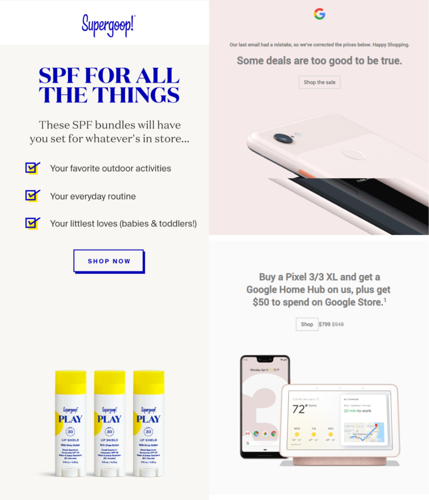
While these ghost buttons lend a clean, minimalistic aesthetic to the email, their subtly and unobtrusive design is best employed for secondary CTAs. After all, they are called ghost buttons for a reason – they can be invisible to the untrained eye. This is why filled-in buttons have proven to deliver better results.
Try using a healthy combo like LinkedIn’s welcome email. Instead of confusing your subscribers with multiple buttons, they establish a natural hierarchy by using a filled-in button for their main CTA and a transparent design for their secondary CTAs.

How much whitespace is needed?
Whitespace gives your CTA Button room to breathe. If you crowd your email with other design elements, your call-to-action will take the back seat and may not stand out as much as you need it to. Use your spacers and dividers and add extra padding around email elements to help increase the readability of your emails.
What colours should I use?
Different colours evoke different emotions. So it’s important that your copy matches the tone of the design. However, it doesn’t mean you should jump ship and completely rebrand the colour scheme of your emails.
So we’ve listed a bunch of colours below and how they influence a shopper’s decision. Keep in mind these colour interpretations are not universal. You’ll need to test what works best for your audience.
- Red – Increases your heart rate and creates a sense of urgency. This is why you’ll see this colour most commonly used for limited-time offers and flash sales.
- Blue – Projects a sense of calm, trust and security which is why you’ll often this colour used in the finance and banking industry.
- Green – Green is associated with relaxation, comfort and wealth. It’s also one of the easiest colours to process, being associated with “Go” which is a motivator for many customers.
- Orange – Similar to red this colour is aggressive and used for urgency-driven CTAs that are targeting impulse shoppers.
- Yellow – Evokes feelings of optimism and youthfulness and will often be used to entice window shoppers.
- Purple – Used to soothe and calm which is why it is often seen in beauty or anti-aging products.
- Pink – Traditionally a romantic and feminine colour that is used to market to young women and girls.
- Black – Powerful and sleek colour that is used to promote luxury products.
We recommend staying clear of your greys or muted colours as they are commonly associated with dead or unclickable links which don’t tend to draw people in.
It’s also important to pair colours that increase the visibility of your CTA. Take the example below, the white text gives a high contrast to the blue background colour making it stand out and likely to produce more conversions over a button with low colour contrast.

Here’s our blog with more tips on how to increase email engagement and conversions: 5 Ways to Increase Email Opens and Engagement
What fonts should I use?
You might be a fan of your fancy fonts but not everyone can easily read cursive writing. We recommend sticking to your web-based fonts. The majority of email clients support the following fonts:
- Arial
- Comic Sans MS
- Courier New
- Georgia
- Lucida Sans Unicode
- Tahoma
- Times New Roman
- Trebuchet MS
- Verdana
If you want to play around with different fonts, make sure you conduct a litmus test in Vision6 to see how your fonts render across different email clients. Email browsers that don’t support your chosen font will substitute a default that may be completely different and off-brand.
What words do I include in my call to action copy?
Ideally, your button copy should be 2-4 words or around 14 characters long. Using verbs like “order” or “explore” has proven more effective at driving action, especially when pairing it with urgent language like “now”. A study from Unbounce also showed the use of first person in your CTA copy can increase your click-throughs by 90%.
Don’t be misleading! Subscribers should know exactly what action will take place just by the copy in your CTA. For e.g. Find Out More should be taking subscribers to a landing page where they can read more about your cause before they commit to anything. If you’re linking subscribers who are still in the consideration phase straight to a signup form you are going to receive a lot of bounces.
Where do I position my call to action button?
More often than not you’ll have multiple calls to action in one email. But it’s important that your secondary CTAs don’t draw attention away from your main CTA. Call to action buttons don’t always need to be positioned right up the top but they do need to be visible at the exact moment a customer wants to convert.
While we recommended positioning your main CTA “above the fold”, you also need it at the very bottom. This is because mobile users are more likely to scroll to the bottom of your email than desktop viewers. These users are also way more likely to be engaged, so don’t them work harder to find your CTA.
Bonus fact:
If you’re including any customer testimonials, reviews or ratings in your email make sure you have a CTA nearby. Customer proofs like this can be a powerful tool when it comes to pushing your potential leads down the funnel.
Keep it consistent!
You don’t want to confuse your readers by using a lot of different colours. Just like our minds have been trained to identify hyperlinks when we see blue text highlighted, your subscribers will be conditioned to recognise your primary and secondary call to action buttons.
Looking for more tips on what makes a really good email design? Check out our guide on Everything You Need to Know About Email Design (WIth Examples)